Scaling Artwork, Continued
Uniformity
When you prepare a series of illustrations for a publication, draw them all to
the same scale, if possible. This will save you time at the camera, in the
darkroom, and in preparing the mechanical paste-up. This will also improve
the overall appearance of the product. Carefully plan artwork that contain
text to assure a uniform size of the text in the finished product.
Limitations
There are limitations on the amount of reduction or enlargement a piece of
artwork can endure. Prepare your line copy for same size or smaller
reproduction. In general, make your artwork a maximum of two times larger
or a minimum of one and one-half times larger than the desired size, or at
another scale in between the two, as long as it remains proportionally
correct. This technique minimizes irregularities and makes the drawing
appear more finished. Artwork drawn very large and extensively reduced
will begin to fill in detail and appear dark and heavy. Artwork drawn small
and enlarged will appear crude and rough because defects tend to magnify.
Before beginning a drawing for reproduction, remember that both the lines
and the spaces between the lines are reduced or enlarged.
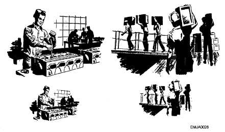
Figure 1-30 shows the effects of enlargement and reduction on artwork.
Figure 1-30.—Reduction and enlargement will lose detail and
magnify defects in reproduced artwork.
1-41


