Studio Cards, Continued
Legibility
Content (text or image) and image size affect the legibility of television
graphics. Contrast text sharply with the background. Reduce large or
complicated material to simple and essential elements or rearrange and divide
information into units. You should set standards of uniformity in text size by
defining the limitations in maximum and minimum height. Attempt to
confine text to no more than 10 words on the screen at a time. Eliminate
very fine detail from the imagery. Keep it simple and bold to increase
emphasis and strengthen impact.
Types
The four types of studio cards are the standard studio card, the plain title
card, the illustrated title card, and the super title card.
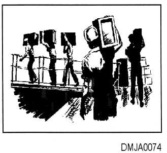
Standard studio Standard studio cards contain only illustrations or pictures. Lettering never
cards
appears on a standard studio card. Often, viewgraphs or 35mm slides are
made from the standard studio card.
Figure 3-7 is an example of a standard studio card.
Figure 3-7. —Standard studio card.
Continued on next page
3-10


