Compositional Elements, Continued
Balance
Balance is the visual perception of how information sits on a page.
Images
should have balance in shapes, masses, tonal areas, and colors.
Combinations of these elements imply a visual weight that anchors your
attention. Disproportionately weighted images leave veiwers feeling off
balanced. A balanced picture area presents information without creating
discord.
Unbalanced presentations leave the viewer feeling as if something
is wrong in the image.
Three general classifications of balance are
symmetrical and asymmetrical, commonly referred to as formal and informal
balance respectively, and radial balance.
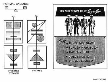
FORMAL BALANCE: Formal or symmetrical balance results when each
object is placed squarely on an imaginary vertical centerline, or by
duplicating on one side each mass, shape, or line that appears on the other
side of an imaginary vertical centerline. Formal balance is also the result of
structuring the elements in the picture area to resemble a pyramid or inverted
pyramid. In formal balance, the weight on the left side of the picture area
should balance the weight on the right side and the bottom half should
balance the top half.
Figure 1-15 shows examples of formal balance structures.
Figure 1-15.—Examples of formal balance.
Continued on next page
1-18


