Compositional Elements, Continued
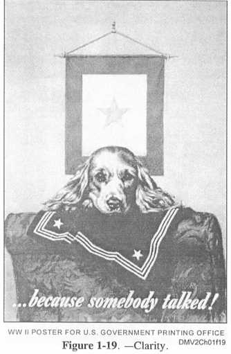
Clarity
Clarity defines elements and guards against blending elements that can
confuse the viewer. It is important to maintain legibility in lettering and
definitiveness in composition. For example, overlapping objects in the
picture area to obscure secondary objects beyond the point of recognition
reduces the clarity of the message you are trying to convey.
Use contrasting
tones when lettering over objects to avoid blending similar tonal areas in
subsequent reproductions. Examine your thumbnail sketches for clarity
before laying out finished drawings.
Figure 1-19 is an example of clarity.
1-23

