Organization Chart, Continued
Chart format
Organization charts should conform to specific standardized practices while
maintaining the principal points of completeness, simplicity, clarity,
symmetry, and unity.
STANDARDIZED PRACTICE: Section blocks should be the same size, and
drawn on the same level. In limited space, draw subsidiary components in a
vertical line directly below the parent component. When drawing lines of
authority to vertically drawn components, use one line and branch each
subsidiary unit from it. Do not use diagonal lines. Avoid crossing lines of
authority.
COMPLETENESS: Make an organization chart as complete as possible in
identifying component relationships. Write notes on subsidiary activities,
additional duties, inactive functions, and provide other clarifying statements.
Place the date in the upper-left corner.
SIMPLICITY: Eliminate confusing or complicated elements. Arrange
blocks to simplify lines of authority so long as the information on the chart
remains correct.
CLARITY: Clarity and simplicity are similar, not identical. A chart with
only a limited number of blocks is simple but if the lines are confusing or the
blocks or titles omitted, the chart is not clear.
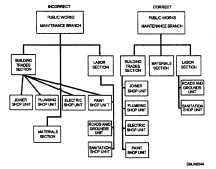
Figure 2-6 shows effective and ineffective organization charts.
Figure 2-6. —A correctly and
incorrectly drawn organization
chart.
Continued on next page
2-10


