Prepress Preparation, Continued
Stock selection
When you select paper for a particular job, consider the printing process (if
printing illustrations) and the purpose of the end product. Line drawings and
text reproduce well on any stock, however, heavily laid paper is difficult to
print with halftones. The purpose of the job also affects the selection of
stock. If the job must be durable, select a good paper; if a job will ultimately
be thrown away, select a thin, inexpensive paper stock. Consider the bulk of
the stock for large publications and whether it will require a more rigid stock
as a cover. A self cover is defined as using the same stock for the cover that
you used for the text.
Typography
Typography or type is divided into text type used for solid blocks of text and
display type used for display advertising and headings. The design of a style
of type is known as typeface and is identified by a name, such as Futura,
Bodoni, or Clarendon. Select a typeface appropriate to the mood expressed
by the copy. Although less a factor in the selection of body text, a dynamic
typeface used in display text can make the difference between a successful
and a mediocre product.
Typesetting
Machine set text type ranges from 8 to 14 point. For small blocks of text and
cut lines or captions for illustrations, 12-point type is ideal. For general
purpose text use a lo-point letter.
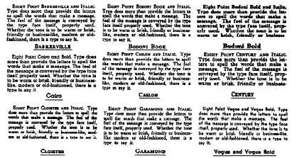
Figure 1-10 shows examples of various typefaces.
Figure 1-10. —A block of text set in various typefaces.
Continued on next page
1-15


