Prepress Preparation, Continued
Type size -
weight
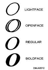
The weight of type may be lightface, open-face, regular weight, or boldface.
Additionally, letter dimensions may be condensed, expanded, geometrically
symmetric or italicized.
LIGHTFACE: Thin, hairline strokes that give a light, airy illusion to the
letter style are characteristic of a lightface letter.
OPEN-FACE: An open-faced letter appears to be an outline of the letter
with the center portions left open. Open-faced letters, when left open, appear
lighter in weight than when filled in. You may fill in an open-faced letter
with a contrasting color or colors for a creative effect.
REGULAR WEIGHT: Neither too thick or too thin, a regular weight letter
reproduces at optimum legibility.
BOLDFACE: Boldface letters appear heavy and dense. They add emphasis
and seem to jump from the page when used judiciously in body text.
Figure 1-14 shows letter weight.
Figure 1-14.—Using the
letter "O" to demonstrate
letter weight.
Continued on next page
1-19


