Prepress Preparation, Continued
Legibility
Legibility is your primary concern when selecting typefaces. The factors that
contribute to legibility are the style of the letter; the type size; the line length;
the spacing between lines, words, and letters; the indentations; and the
margins around the print.
Style of the
letter
Letter styles denote the overall appearance of a letter. A letter has height,
weight, and decoration. Letter height is the vertical height of the letter.
Letter weight is how thick (boldface) or thin (lightface or open-faced) a letter
appears and whether it is condensed, expanded, or geometrically symmetric.
A letter may also have serifs, kerns, and other decorative elements that affect
legibility and identify it as a particular style. Simpler letter styles, such as a
Roman, Helvetica, or Bookface, have unobtrusive serifs and are easier to
read than more ornate styles. Gothic, Stymie, or other letters that are sans
serif or have unusual serifs are tiring to read for any length of time. Ornate
and decorative typefaces lose impact when used extensively and repel readers
when used as body text.
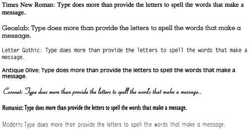
Figure 1-12 shows letters of different decor as body text.
Figure 1-12.—Type styles as text.
Continued on next page
1-17