Letter Compositions, Continued
Overlapping
letters
Overlapping letters is a valid design concept particularly with informal
lettering layouts. When overlapping letters, take care not to overly deform
the integrity of the letters and render them illegible. Allow enough letter
form to remain so that the eye can fill in the remaining parts and identify the
letter.
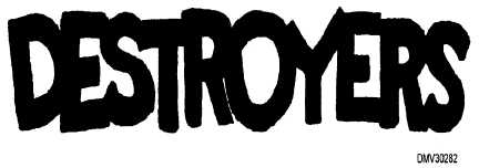
Figure 5-45 is an example of properly overlapped letters.
Figure 5-45.—Properly overlapped letters.
Negative letters
Letters rendered in negative format are simply letters where the space around
them is filled in and the letters themselves appear empty. Negative letters are
more appropriately suited to informal lettering layouts.
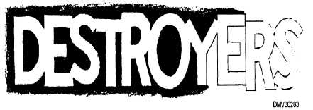
Figure 5-46 shows a negative letter format.
Figure 5-46.—Negative letters.
5-42


