Letter Compositions, Continued
Justification
Justification is an adjustment in spacing that makes lines of lettering equal in
length regardless of the number of characters per line. Each line starts and
stops on the same margin line as every other line. Although symmetrical in
appearance, overuse of this technique becomes monotonous.
Figure 5-43 shows three lines of type justified.
Figure 5-43.—Justification.
Flush left or
right
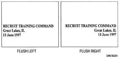
Lettering set flush left or right have a common beginning (flush left) or end
(flush right). Flush set lettering is very effective and offers an asymmetrical
balance more typical of informal lettering layouts.
Figure 5-44 shows how lettering set flush left or right enhance informal
lettering layouts.
Figure 5-44.—Flush set lettering.
Continued on next page
5-41


